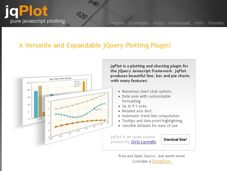
jqPlotというjQueryのPluginを使うと手軽に綺麗なグラフを描くことができます。
最もシンプルなサンプル
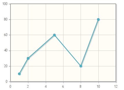
データをプロットして線でつなぐだけのシンプルなサンプルです。1の値が10、2の値が30、、、というデータの配列を渡すだけで線グラフが描けます。
$.jqplot('chart',
  [
    [[1, 10], [2, 30], [5, 60], [8, 20], [10, 80]]
  ]
);
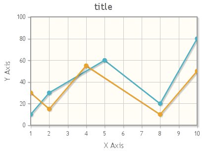
複数のグラフを同時に描く
2つの線グラフを同時に描くサンプルです。
$.jqplot('chart',
  [
    [[1, 10], [2, 30], [5, 60], [8, 20], [10, 80]],
    [[1, 30], [2, 15], [4, 55], [8, 10], [10, 50]]
  ],
  {
    title: 'title',
    axesDefaults: {
      labelRenderer: $.jqplot.CanvasAxisLabelRenderer
    },
    axes: { xaxis: { label: 'X Axis', pad: 0 }, yaxis: { label: 'Y Axis'} }
  }
);
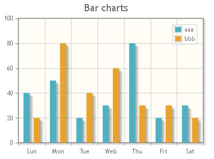
棒グラフのサンプル
棒グラフのサンプルも作ってみました。
$.jqplot('chart',
  [
    [40, 50, 20, 30, 80, 20, 30],
    [20, 80, 40, 60, 30, 30, 20]
  ],
  {
    title: 'Bar charts',
    seriesDefaults:{
      renderer:$.jqplot.BarRenderer,
    },
    series: [
      { label: 'aaa' },
      { label: 'bbb' }
    ],
    legend: {
      show: true
    },
    axes: {
      xaxis: {
        renderer: $.jqplot.CategoryAxisRenderer,
        ticks: ['Sun', 'Mon', 'Tue', 'Web', 'Thu', 'Fri', 'Sat']
      }
    }
  }
);
jqPlotは他にも円グラフなどいろいろなグラフを描くことができますので、使ってみてはどうでしょうか?詳細についてはjqPlotのドキュメントを参照してみてください。
サンプル
この記事で紹介したjqPlotのサンプルコードは下記でご覧になれます。
jqPlot – テストコード置き場
Line charts – テストコード置き場
Bar charts – テストコード置き場
リンク
- jqPlot Usage
http://www.jqplot.com/docs/files/usage-txt.html