前回に引き続きflexboxについて簡単にまとめてみたいと思います。今回は、左寄せや上寄せ等、位置揃えがテーマです。
横方向の配置
横方向の配置はjustify-contentの値で設定できます。
.flex-row {
  width: 100%;
  height: 50px;
  display: flex;
  flex-direction: row;
}
左寄せ
justify-content: flex-startとします。
<div class="flex-row" style="justify-content: flex-start">
  <div style="width: 20%">1</div>
  <div style="width: 20%">2</div>
  <div style="width: 20%">3</div>
  <div style="width: 20%">4</div>
</div>
※灰色の部分は<div class="flex-row">の外側、白色の部分は<div class="flex-row">の内側でどの要素も表示していないスペース(余白)部分になります。
右寄せ
justify-content: flex-endとします。
<div class="flex-row" style="justify-content: flex-end">
  <div style="width: 20%">1</div>
  <div style="width: 20%">2</div>
  <div style="width: 20%">3</div>
  <div style="width: 20%">4</div>
</div>
中央揃え
justify-content: centerとします。
<div class="flex-row" style="justify-content: center">
  <div style="width: 20%">1</div>
  <div style="width: 20%">2</div>
  <div style="width: 20%">3</div>
  <div style="width: 20%">4</div>
</div>
スペース(余白)が均等になるように配置
スペース(余白)が均等になるように配置する場合はjustify-content: space-betweenを使います。
<div class="flex-row" style="justify-content: space-between">
  <div style="width: 20%">1</div>
  <div style="width: 20%">2</div>
  <div style="width: 20%">3</div>
  <div style="width: 20%">4</div>
</div>
両端にもスペース(余白)を配置する場合はjustify-content: space-aroundを使います。
<div class="flex-row" style="justify-content: space-around">
  <div style="width: 20%">1</div>
  <div style="width: 20%">2</div>
  <div style="width: 20%">3</div>
  <div style="width: 20%">4</div>
</div>
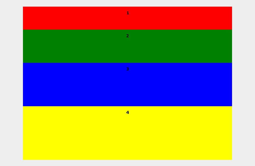
縦方向の配置
縦方向の配置はalign-itemsの値で設定できます。
.flex-column {
  width: 100%;
  height: 200px;
  display: flex;
  flex-direction: column;
}
上寄せ
上寄せで配置する場合はalign-items: flex-startを使います。
<div class="flex-row" style="align-items: flex-start; height: 200px">
  <div style="flex-grow: 1; height:  50px">1</div>
  <div style="flex-grow: 1; height: 200px">2</div>
  <div style="flex-grow: 1; height: 150px">3</div>
  <div style="flex-grow: 1; height: 100px">4</div>
</div>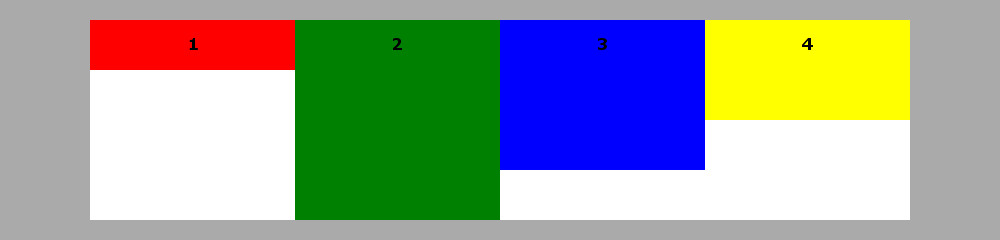
下寄せ
下寄せで配置する場合はalign-items: flex-endを使います。
<div class="flex-row" style="align-items: flex-end; height: 200px">
  <div style="flex-grow: 1; height:  50px">1</div>
  <div style="flex-grow: 1; height: 200px">2</div>
  <div style="flex-grow: 1; height: 150px">3</div>
  <div style="flex-grow: 1; height: 100px">4</div>
</div>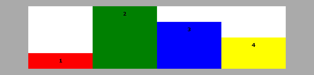
中央に揃え
中央に揃えて配置する場合はalign-items: centerを使います。
<div class="flex-row" style="align-items: center; height: 200px">
  <div style="flex-grow: 1; height:  50px">1</div>
  <div style="flex-grow: 1; height: 200px">2</div>
  <div style="flex-grow: 1; height: 150px">3</div>
  <div style="flex-grow: 1; height: 100px">4</div>
</div>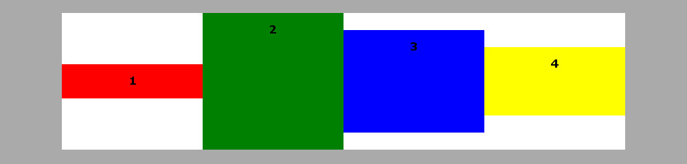
サンプル
この記事で紹介したサンプルコードは下記でご覧になれます。
CSS3のflexboxを使ったサンプル その2