CSSを使ったリボン風のデザインを紹介したいと思います。PhotoshopやGIMPなどでデザインするのも悪くはありませんが、CSSで作ると拡大、縮小が自由自在なのが1つ利点に挙げられます。
少しだけCSSの解説
サンプルの前に少しだけCSSの解説をしたいと思います。
ここでのポイントは、:before/:afterとborderの2点かと思います。
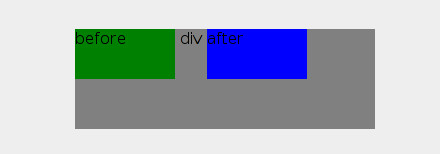
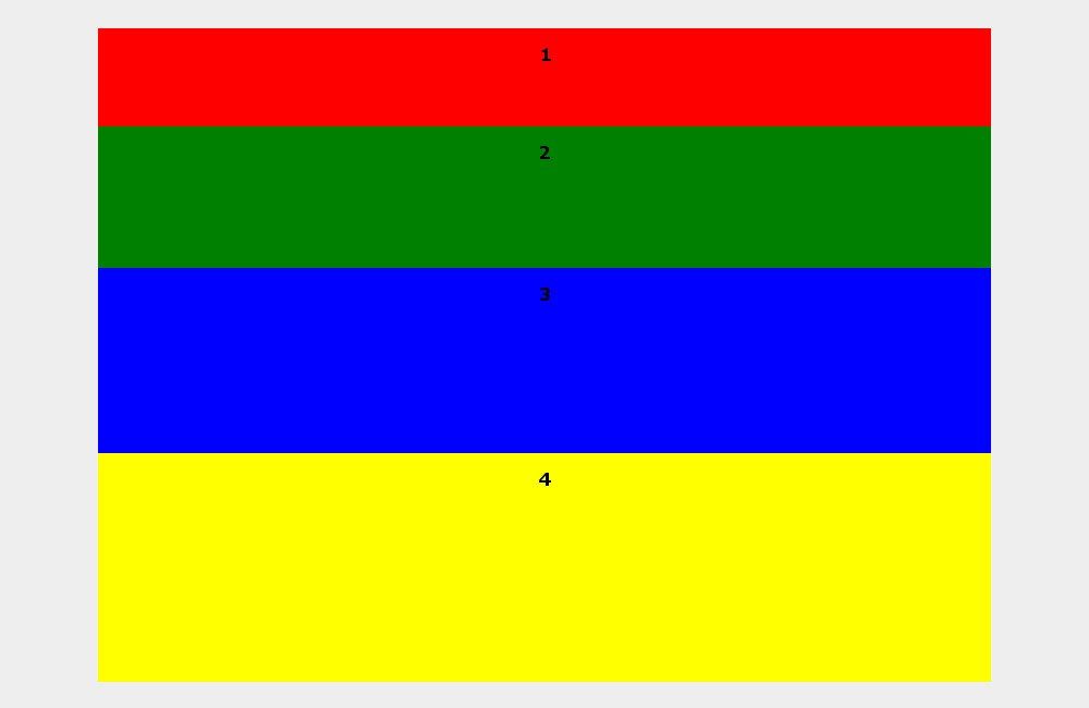
まず、:before/:afterの方ですが、div:before/div:afterとした場合に<div>の内側に配置されることに注意です。以下、簡単なサンプルになります。
div {
  width: 300px;
  height: 100px;
  background-color: gray;
}
div:before {
  width: 100px;
  height: 50px;
  background-color: green;
  content: 'before';
  display: inline-block;
}
div:after {
  width: 100px;
  height: 50px;
  background-color: blue;
  content: 'after';
  display: inline-block;
}
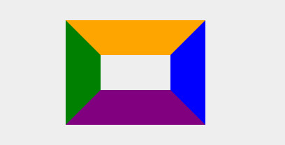
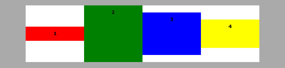
続いて、borderの方です。普段1pxなどの細い線を同色で描いていると分かり辛いですが、太い線を異なる色で描いた場合の境界部分の取り扱いが注意点になります。これを使ってリボンの三角形部分を描いていきます。
以下は4辺を違う色で描いたサンプルになります。
div {
  width: 100px;
  height: 50px;
  border-width: 50px;
  border-style: solid;
  border-left-color: green;
  border-right-color: blue;
  border-top-color: orange;
  border-bottom-color: purple;
}
後、位置合わせのposition: absolute;については、スタイルシートで真ん中に表示するも参考にしてください。
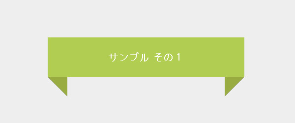
以下は<h2>をリボン風にデザインしていくサンプルになります。
サンプル その1
h2 {
  margin: 200px auto;
  padding: 0;
  color: #ffffff;
  background-color: #b1cd52;
  line-height: 80px;
  font-size: 20px;
  width: 400px;
  text-align: center;
  position: relative;
}
h2:before, h2:after {
  content: '';
  border: 40px solid transparent;
  position: absolute;
  z-index: -1;
}
h2:before {
  border-right-color: #99ac41;
  top: 50%;
  left: -40px;
}
h2:after {
  border-left-color: #99ac41;
  top: 50%;
  right: -40px;
}
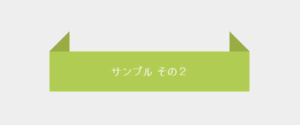
サンプル その2
h2 {
  margin: 200px auto;
  padding: 0;
  color: #ffffff;
  background-color: #b1cd52;
  line-height: 80px;
  font-size: 20px;
  width: 400px;
  text-align: center;
  position: relative;
}
h2:before, h2:after {
  content: '';
  border: 40px solid transparent;
  position: absolute;
  z-index: -1;
}
h2:before {
  border-right-color: #99ac41;
  top: -50%;
  left: -40px;
}
h2:after {
  border-left-color: #99ac41;
  top: -50%;
  right: -40px;
}
サンプル その3
h2 {
  margin: 200px auto;
  padding: 0;
  color: #ffffff;
  background-color: #b1cd52;
  line-height: 80px;
  font-size: 20px;
  width: 400px;
  text-align: center;
  position: relative;
}
h2:before, h2:after {
  content: '';
  border: 40px solid transparent;
  position: absolute;
  z-index: -1;
}
h2:before {
  border-right-color: #99ac41;
  top: 50%;
  left: -40px;
}
h2:after {
  border-color: #b1cd52;
  border-right-color: transparent;
  top: 0px;
  right: -40px;
}
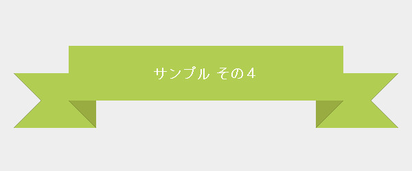
サンプル その4
h2 {
  margin: 200px auto;
  padding: 0;
  color: #ffffff;
  background-color: #b1cd52;
  line-height: 80px;
  font-size: 20px;
  width: 400px;
  text-align: center;
  position: relative;
}
h2:before, h2:after {
  content: '';
  border: 40px solid transparent;
  position: absolute;
  z-index: -1;
}
h2:before {
  background-color: #b1cd52;
  border-color: transparent;
  border-left-color: #eee;
  border-right-color: #99ac41;
  top: 50%;
  left: -80px;
  width: 40px;
}
h2:after {
  background-color: #b1cd52;
  border-color: transparent;
  border-left-color: #99ac41;
  border-right-color: #eee;
  top: 50%;
  right: -80px;
  width: 40px;
}